Highlight parent menu items when viewing sub-pages
I noticed recently that the Beaver Builder theme header menu items were only highlighted when I was viewing the associated page – if I navigated to a subpage of that page, the menu item would no longer remain highlighted.
I like to give as many visual clues as possible to help users understand the context and depth of my site. Highlighting menu items is an important way of indicating where they are on the structure of the site. It also reinforces the main sections of your site – the sections that should be the basis of your header menu.
So keeping main menu items highlighted when viewing subpages is really important to me. There are two ways to achieve this:
Nested Menu Items
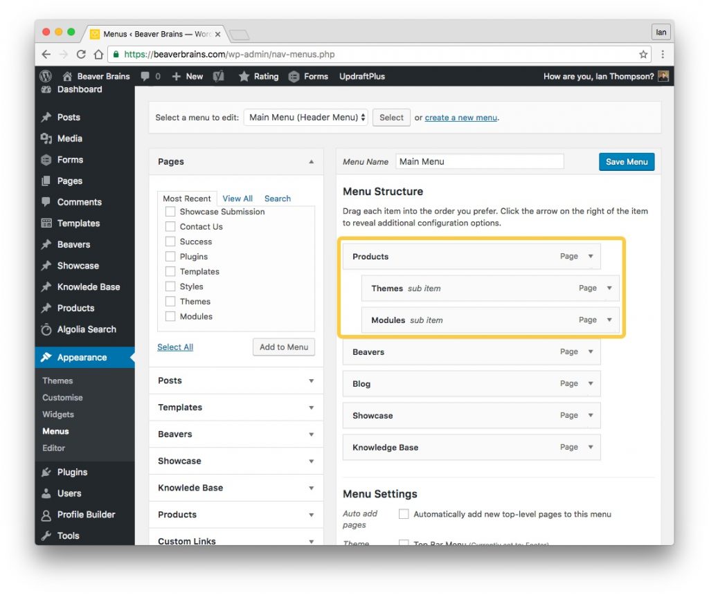
The first way expects that you have nested sub-menu items in your header menu.
Add nested menu items to your header menu as per the screenshot below.
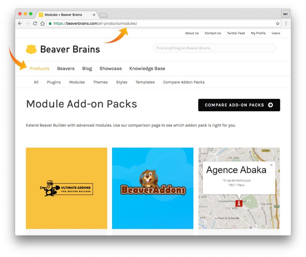
With ‘Themes’ and ‘Modules’ nested below ‘Products’ in this example and using the CSS code above, ‘Products’ will always remain highlighted when navigating to either of these sub-pages. The screenshot below shows that I am on the module page and the ‘Products’ menu item is still highlighted.
Nested Pages
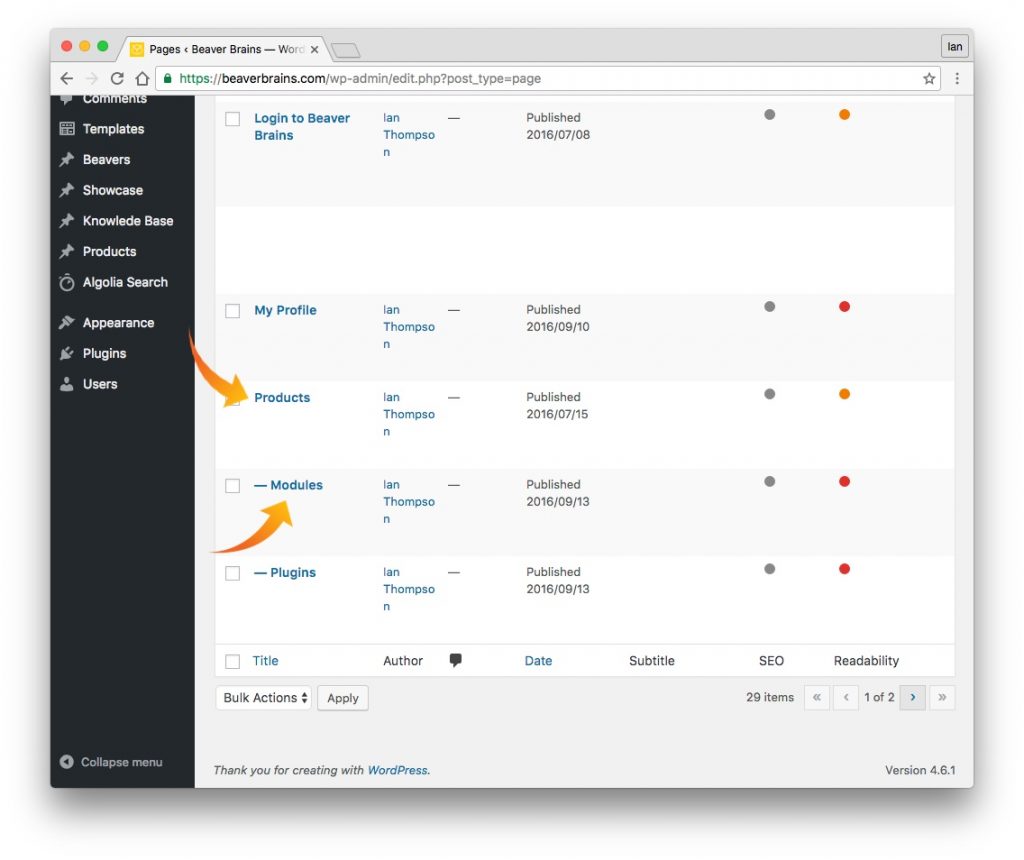
This next option expects that the pages and subpages of your site are nested. See the screenshots below for an example. In the CSS code, you’ll notice that the only thing that has changed, is instead of – ‘.current-menu-ancestor’ – we now write ‘.current-page-ancestor’. This ensures that any pages nested below your main menu item will remain highlighted.
In the screenshot above you can see that Modules is a subpage of Products so using the CSS will ensure that when you are on the Modules page, the Products menu item will remain highlighted.
Add either CSS snippet to your style.css file in your child theme, or add it to the Beaver Builder Global settings CSS tab, or in the theme Customiser –> Code –> CSS Code tab.
This solution is in part thanks to the Beaver Builder support article I found here.


Use the following code in Code CSS customizer to get the same result”
li[class*=”current”] > a {
color: #xxxxxx !important;
}
If you want a line of 2 pixels in the same color under it to give the menu-item even more ‘attention’, add the following to the code above:
border-width: 2px;
border-bottom-style:solid;
Thanks, Peter – I tried that but it doesn’t seem to work for me.
I did that in several themes, including BB theme, but also in Genesis/Dynamik combinations.
Maybe just this site – I’ll give it a go on another – thanks, Peter!
Did you try it anywhere else? Check the ” signs in the code I supplied.
Thanks for the heads up, your solution worked for me. Although, for anyone having an issue, make sure the quotation marks look like ” (not ”) and enter a proper hex colour code, like f00 or ff0000 for red.
Very cool tip Ian. Thanks
Thanks, David – I just wish I could figure out how to get Beaver Builders menu module to highlight the current menu item too and I’m done!
Hi Ian,
Thanks for the tip i just discover on your website, many interesting things here ;-).
It works OK for me… if the menu is integrated with the customizer.
But i use a custom header and integrate my menu with BB menu module.
Unfortunately, the “current-page-ancestor” class is not handled in that case, neither another specific class we could target.
I keep searching.
I asked Beaver Builder support: they answered me BB Menu module uses the “current-menu-ancestor” class too, so it should work.
I looked in my browser source code again and… didn’t find this class.
BB support finally told me it should work and this certainly was a bug they have to fix: to be continued.
Conclusion: the “current-page-ancestor” class is finally working fine here, i guess Beaver Builder team has fixed the issue in a recent BB Plugin 1.9 update, thanks to them !